Dope Rope Reimagined:
A Bold Shelf Standout.
Project: Brand Identity & Packaging
Client: Detour
Role: Associate Creative Director
Deliverables: Brand Packaging System
A full rebrand that transformed Dope Rope into a bold, unmistakable shelf presence.

Problem
Dope Rope blended into a crowded dispensary shelf.
Inconsistent packaging reduced recognition among consumers and budtenders.
Solution
We reimagined the brand with a bold, unified packaging system and refreshed logo. A vibrant, scalable design language created instant recognition across SKUs.
Results
The rebrand became the foundation of the brand’s identity. It increased visibility, strengthened recall, and gained traction across retail and social.
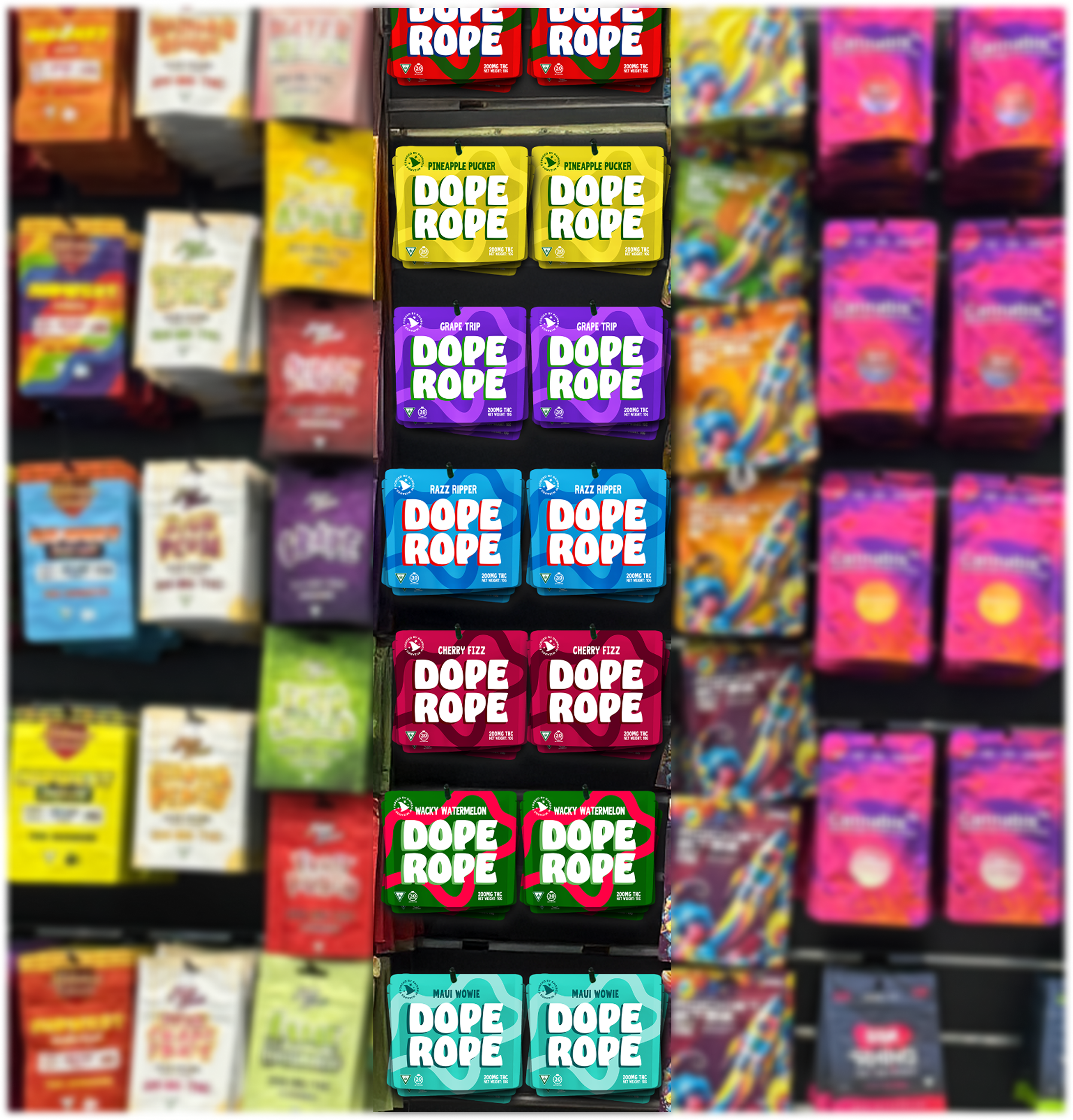
Before
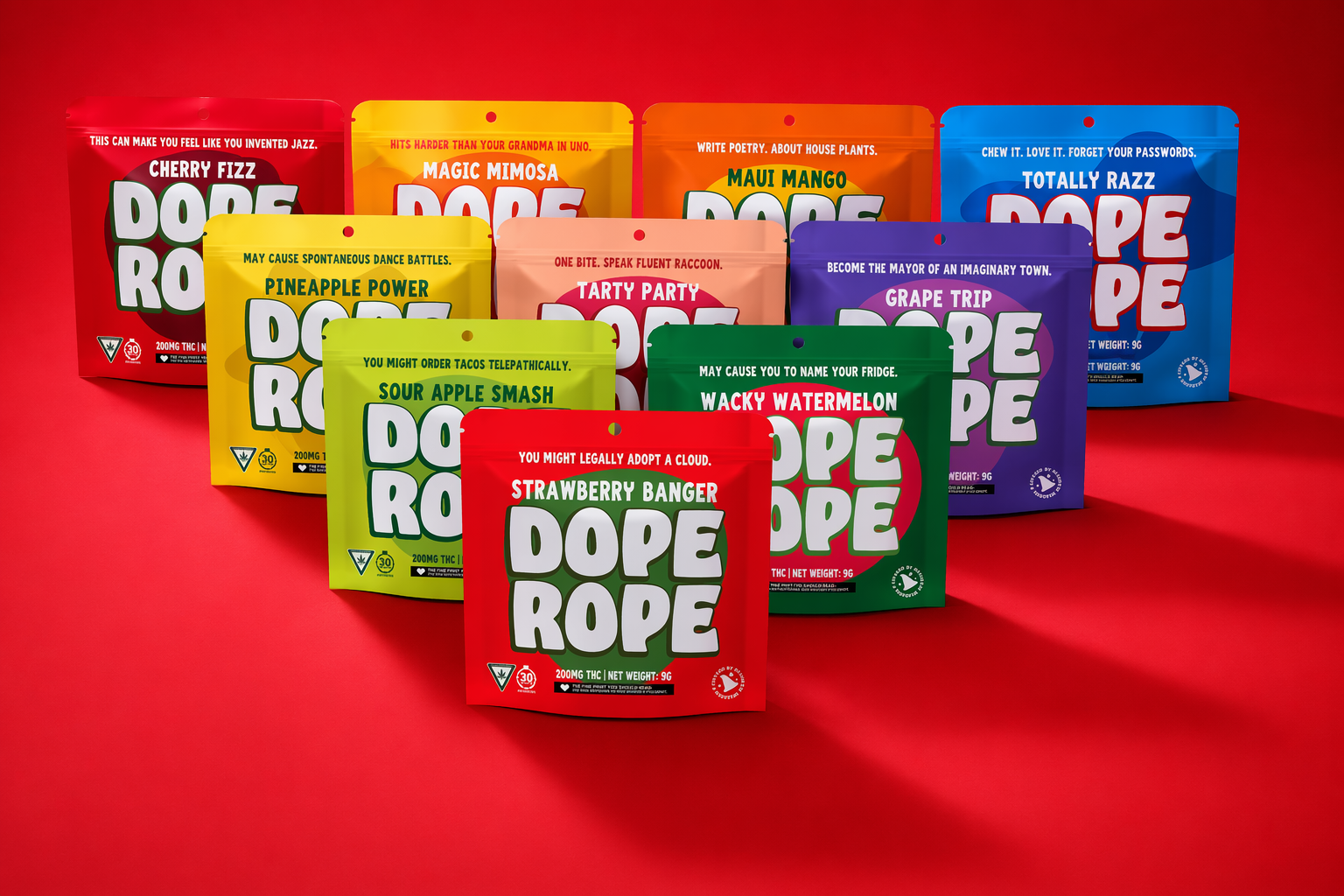
AfteR
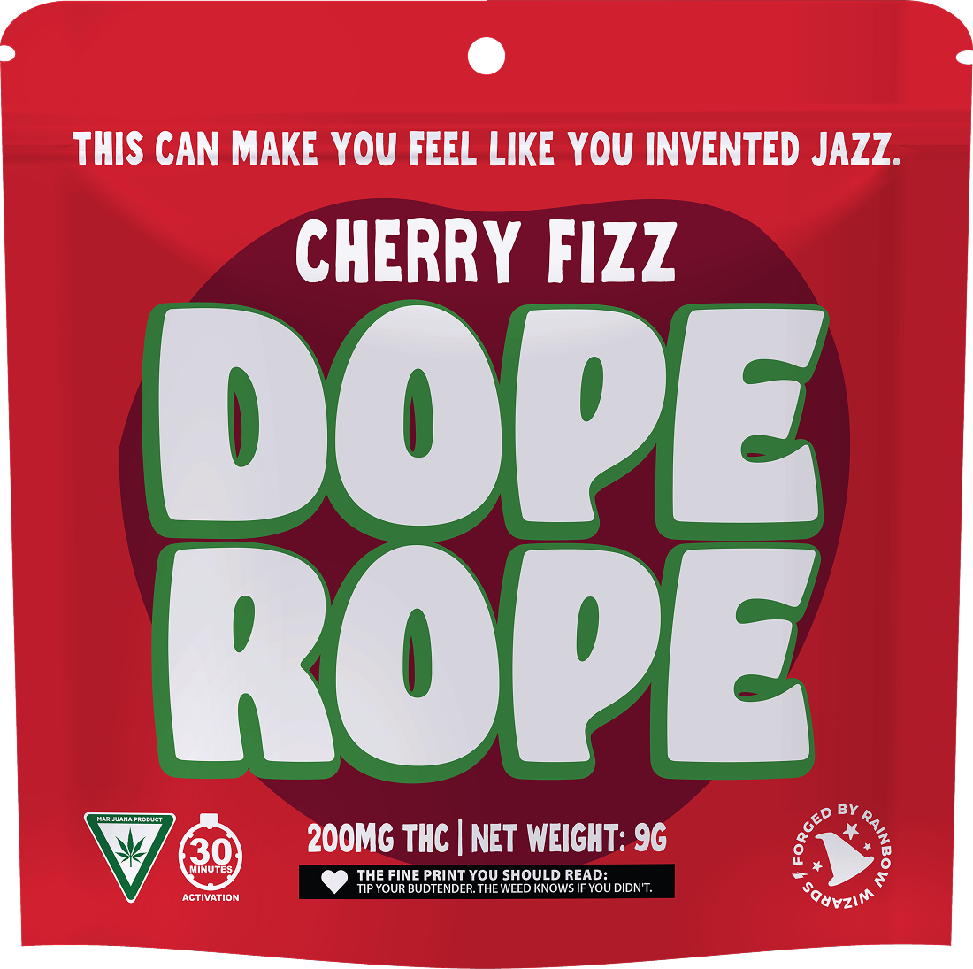
Before:
Inconsistent & forgettable
Dope Rope’s packaging blended in; disparate styles and limited recall.
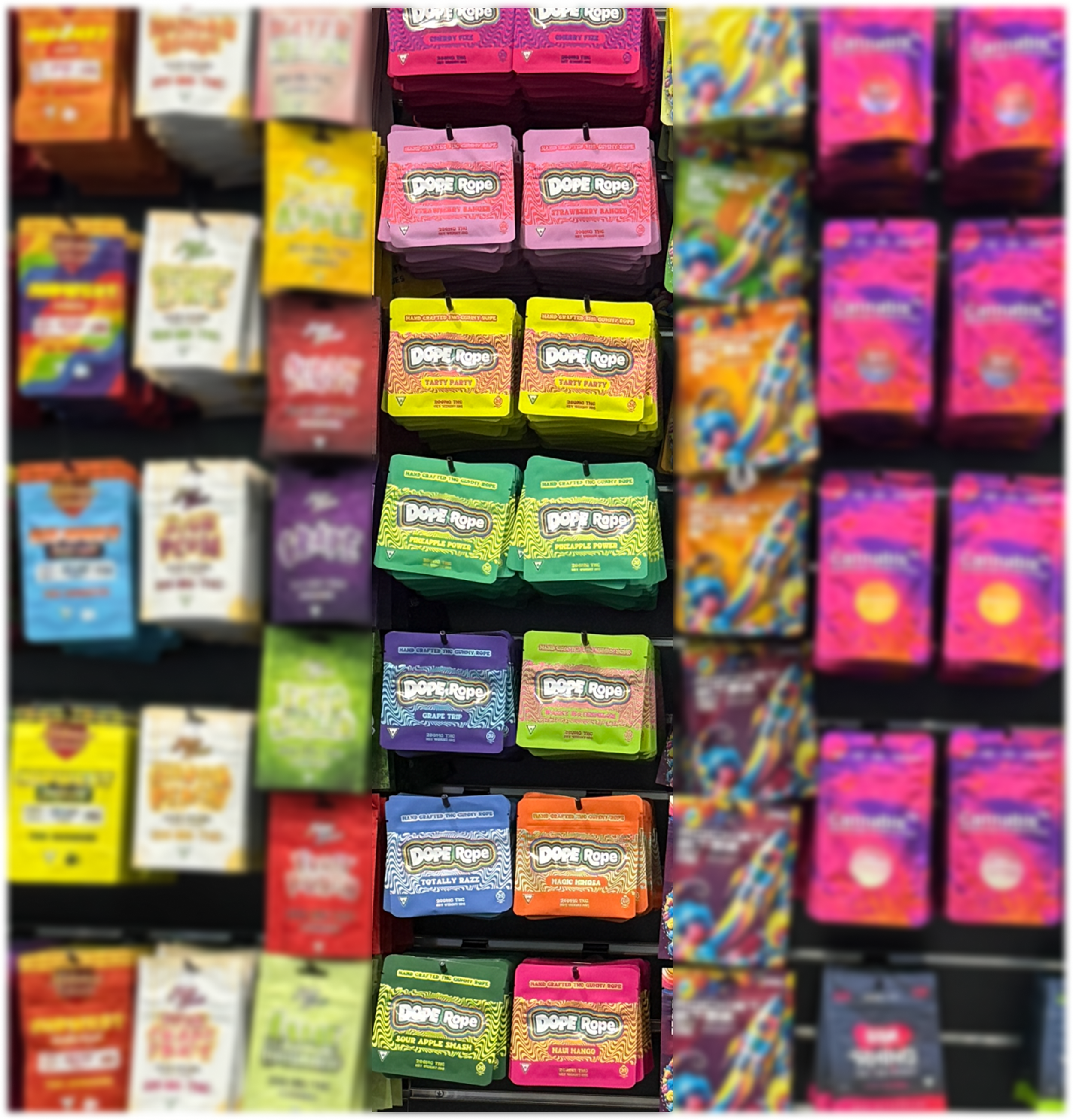
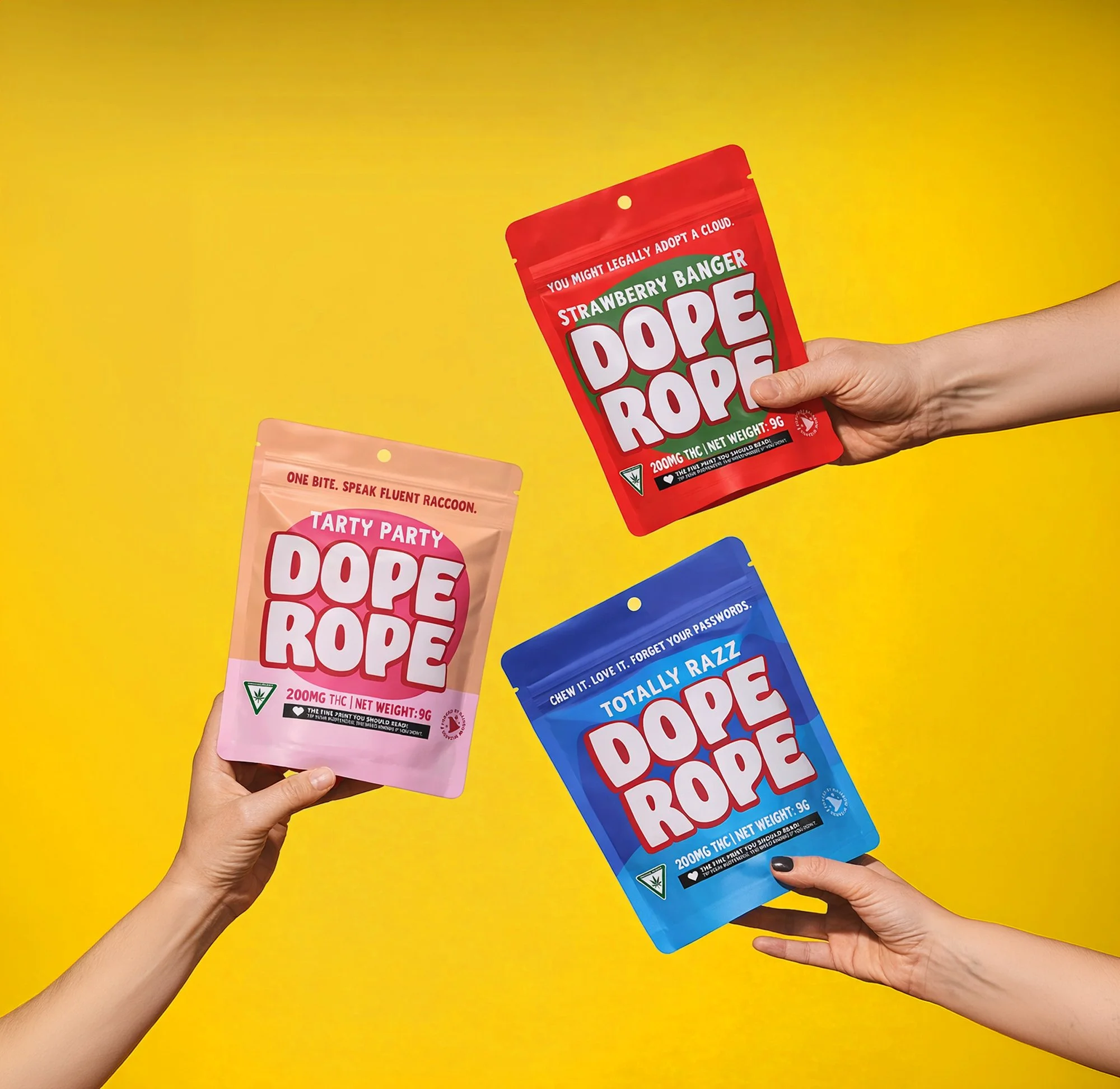
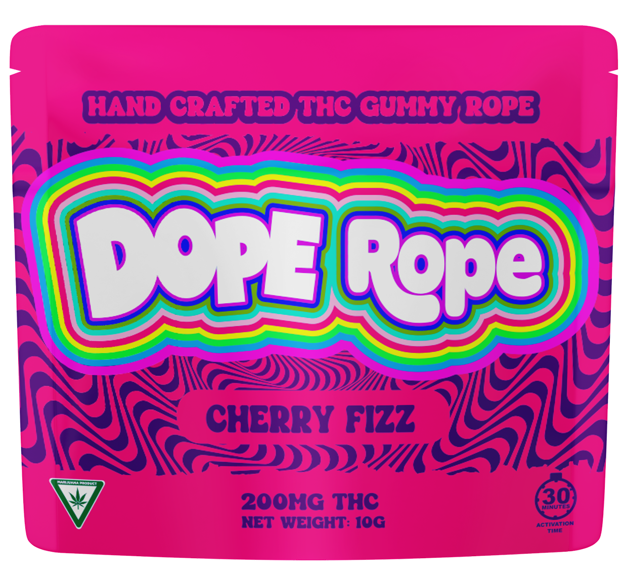
After: Bold & instantly recognizable
A unified, vibrant design system; instantly recognizable, driving engagement and shelf standout.
Bring the Brand to Life
The new identity extended seamlessly into social, becoming a key driver of engagement and brand voice.
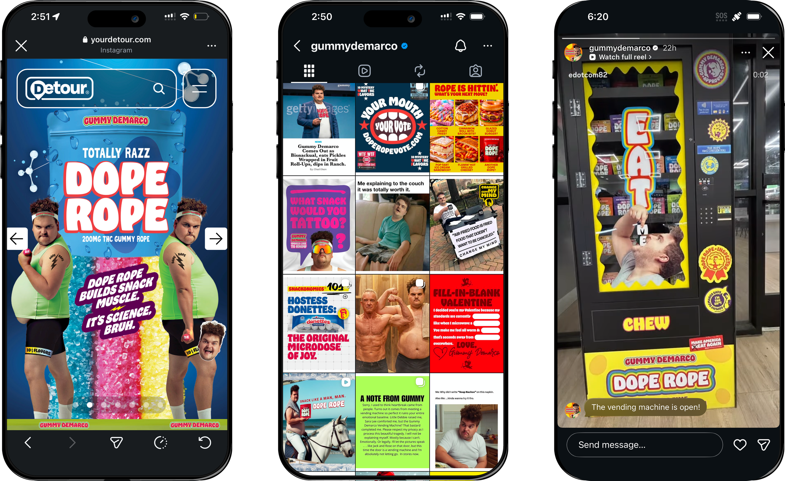
Built for impact in the loudest aisle in retail.